“Ka-chow!” It was time to change the design of Luke’s room and unlike before, I wanted to ask for his inputs this time. But when I asked him for theme suggestions, he only had one thing on his mind: “LIGHTNING MCQUEEN!”
I have to admit, the first time he said that, I tried to convince him to choose other themes that were a bit more minimalist (lol) but he was firm on his decision. So Lightning McQueen it is. The challenge is now on me: How do I design a Lightning McQueen room that’s not… well, too tacky? Haha!
Goal: Achieve a Minimalist Look

Pixar’s Cars isn’t exactly minimalist to begin with. Just one google search and you’ll be blinded with pictures of brightly colored cars in all shapes and sizes set against equally blinding backgrounds of race tracks and city lights. I was set on making sure that the room would be easy on the eyes so I wasn’t going to go the colorful route (pun intended!)
It’s all about the colors!
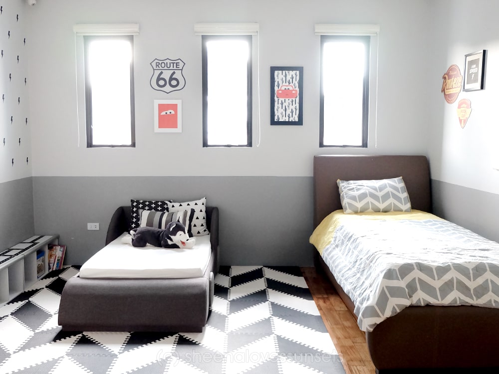
My goal was to achieve a minimalist look; something that’s tastefully done and not (again, sorry,) tacky. I figured the best way to start was to pick a simple color scheme and stick to it. We chose black, white and grey with touches of red and yellow. I would have preferred not having the red and yellow but we needed to get the Lightning McQueen elements or else my client (Luke) will not be happy! Haha.
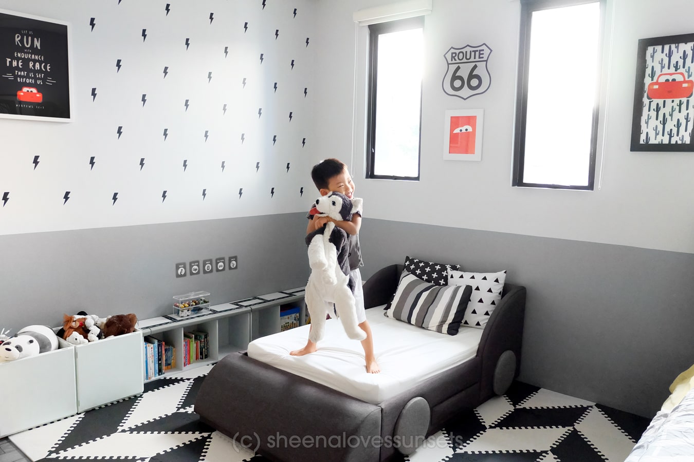
I chose to focus on black and white because it’s reminiscent of the flags that are waved during car races. I intentionally chose to mimic that pattern using the black and white playmats from Bonjour Baby and it made a huge difference in the overall look of the room. Sticking to this neutral scheme for majority of the room also made the reds and yellow pop out more.
Lightning McQueen Details:

I didn’t want to put the usual Pixar Cars posters so instead, I took design elements from the movies. I took the logos of Rusteze and the Piston Cup, had them printed on a thick board and incorporated them as wall decor. Then I created a simple wall artwork with Lightning’s catchphrase “I am speed!”
I also used other car-themed elements in the design that are not necessarily Pixar, like the “Route 66” logo. Other than that, I focused more on modern black and white, minimalist patterns, hence the pillows.

He wanted lightning so he gets lightning! Hehe. We placed lightning-shaped wall stickers from my favorite supplier, White Walls PH. They’re the same ones I got from when I designed our Homeschool/Play Room. I love wall stickers because they’re low maintenance, low commitment (you can take them out easily) and they make a huge impact in the room’s overall look!
Custom Cars Bed 
The centrepiece of Luke’s Lightning McQueen room has got to be his custom-made car bed. We initially planned on getting him one of those plastic Lightning McQueen toddler beds but couldn’t find it in toy stores here. Turned out to be a blessing in disguise because now, we had to be creative. I wore my furniture designer hat on (haha!) and made some sketches for his bed. This was the design my husband and I both agreed on and I must say, I’m very happy with how it turned out too!
Luke was again, insisting on making the bed red because duh, Lightning McQueen, mom and dad! But we were adamant at keeping it more neutral-toned. So instead, we tricked him convinced him that he was getting an amazing Jackson Storm bed instead because Jackson Storm’s faster than Lightning McQueen! He was pretty pleased and was finally on board after that.
Bonus: The wheels can actually be turned, just for fun! Also, can you see the hidden drawer? Yay for storage!
A Room for Playing!

One of Luke’s favorite features in this room is this bookshelf that I turned over. We got it super cheap, had it repainted and I stuck some road tape on top. Instant play set area where he can play with all his mini racers. It’s now his morning routine to play with his cars while he drinks his morning milk.
Placed laminated “chore cards” on top of his shelf so he’s always reminded to start his day well!

My personal favorite thing that I designed for the room is this Lightning McQueen Bible Verse poster. I think the verse is just perfect for the theme and is a great reminder for him as well. Hehe.
Other Side of the Room

The other side of his room had built-in shelves and tables. So mostly, all I had to do was to style the shelves. Luke requested demanded that I needed to make sure there was a photo of the other cars; not just Lightning McQueen. Again, I tried to discourage him because I said it was a Lightning McQueen room; it should all be red (haha I’m sorry!) But I should’ve known better than to argue with a 3 year old.
In the end, I gave in and designed him this poster with all the characters he specifically chose. For fans, those are: Mater, Jackson Storm, Luigi and Chick Hicks! You are welcome, Luke! I don’t think he realizes the full extent of the benefits he gets for having a mom who’s an illustrator and graphic artist. Haha.
Also, if you’re wondering what those grey things are on the corner, those are cushion edge guards. This used to be the area where Luke’s changing pad was when he was a baby but now it’s back to being a working table. Didn’t bother to remove the guards anymore.
Tips When Designing a Minimalist-Inspired Kids Room

If you ask your kids what theme they’d like, chances are they would choose from the myriad of colorful characters they know: Paw Patrol, Disney Princesses and Pixar characters. But don’t fret! With a little bit of creativity and a whole lot of patience (hehe,) I really believe it’s possible to come up with a tasteful room both you and your kid will enjoy!
Here are some tips:
- Stick with only 3-4 main colors: (I only get a pass because black, white and grey are kind of the same, right? Haha.) Focusing on just a few colors is key to establishing a cohesive look for the room. Don’t forget put in neutral tones such as white and grey if you’re going for minimalist.
- Don’t put so many things on the walls: A few framed artworks are good. No need to clutter them up with displays.
- Stay away from commercial posters and stickers: I can’t count the number of times Luke wanted to stick Cars stickers from his sticker books, convinced that it would make his room more Cars-themed. Haha. I’m personally not a fan and believe those would just make the room look messy.
- Keep unrelated decor out: Stick to your theme. No spaceships or dinosaur decor if it’s a cars-themed room. No flowers or fairies if it’s a mermaid-themed room.
- Study design elements unique to the movie/characters: Do they have catchphrases (like Lightning McQueen’s “I am speed,”) unique elements (like Toy Story’s green soldiers) or signature items (like The Little Mermaid’s fork/dinglehopper?) Incorporate those in the room design and decor!
But the most important tip of all: make it FUN for the kids! After all, this is their room, not yours! I had to remind myself that over and over again as I was working on this. Haha.
—


22 Comments
Charlene
November 14, 2018 at 2:09 pmWhere did u get the car bed made?
Sheena Sy Gonzales
November 14, 2018 at 10:46 pmWe have someone who does all our custom furniture made. You can email me and I’ll send you her details privately. Thanks. 🙂
Marie roque
November 14, 2018 at 2:44 pmLove it !!! 🙂 will take ur tips into consideration as i design my children’s room soon !:) tnx sheens 🙂
Sheena Sy Gonzales
November 14, 2018 at 5:47 pmHi Marie, so glad you found this helpful! Can’t wait to see your kids’ rooms soon!
@erikajane24
November 14, 2018 at 5:52 pmVery nice! Thanks for sharing helpful tips
Sheena Sy Gonzales
November 14, 2018 at 7:48 pmWelcome! Glad you found them helpful!
Angeli
November 14, 2018 at 7:16 pmI love how you were able to incorporate all the Lightning McQueen/Cars elements without being too colorful! Too much going on can really be an eyesore.
Sheena Sy Gonzales
November 14, 2018 at 10:46 pmYes that’s what I think so too!! Thanks Angeli always appreciate your inputs! 😉
Jennifer
November 14, 2018 at 9:36 pmHis room is soooo cute!!
Sheena Sy Gonzales
November 14, 2018 at 10:45 pmThanks Jen! Glad you think so!
Jessica
November 17, 2018 at 9:08 amLove it, such a cute and cozy room. Love the choice of neutrals as well, makes the colorful toys pop out even more and easy to find.
Sheena Sy Gonzales
November 18, 2018 at 10:16 amThanks Jessica! Yes I really love neutrals haha.
Valerie
November 20, 2018 at 5:32 amThis room is so cute! I love the fun car bed, and the neutral color scheme is beautiful!
Sheena Sy Gonzales
November 20, 2018 at 4:16 pmThanks Valerie, I’m glad you like it!
Kaitlyn
January 3, 2021 at 9:27 amLove this! So hard to walk the line between satisfying the kiddos love for Cars without being tacky! Do you sell the wall prints?
Sheena Sy Gonzales
January 13, 2021 at 5:51 pmHi Kaitlyn, yes you can send me an email to inquire!
Tiffany
May 16, 2021 at 7:32 amJust came across your post and I LOVE it! Our little guy is begging for a cars themed room and your post helped sell me on it ha ha. Would you sell your graphics? I’m hoping to find two vertical images size 16×20 to print: one similar to your black one with the verse with lightning McQueen and then a second one with a white background and Kachow in the middle. Any chance you’d sell your graphics?
Sheena Sy Gonzales
May 17, 2021 at 2:33 pmHello yes you can send me an email at sheenasygonzales@gmail.com and I’ll give you the rates for the artworks! 🙂
Mary
November 10, 2022 at 11:42 amHow did you space out the lighting bolts! Love this room so much my inspiration for my sons room
Sheena Sy Gonzales
November 17, 2022 at 10:14 pmMeasured it manually with a ruler haha. It’s tedious!
Mou
December 17, 2023 at 1:32 amI loved this room so much
Sheena Sy Gonzales
January 22, 2024 at 5:48 pmThank you!!